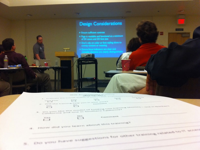
Yesterday, your Web Action Team drove to Oakland to participate in an all day web accessibility training as part of UC's effort to meet Section 508 and Web Content Accessibility Guidelines (WCAG) 2.0. Not only are we required to meet Section 508 guidelines, we should also comply with WCAG 2.0 guidelines as Section 508 is a bit dated and not as comprehensive as WCAG.
While Site Builder 3 is in pretty good shape, we run many, many applications here, and our goal is to bring all of our systems into compliance. However, we can only do so much to control the way content appears. A large part of keeping our Web sites accessible is in your hands!
Tip 1 - Video Content

In order to be accessible, any video you post should have synchronous captions AND a transcript. This is a TON of work and probably the place where our content fails the most. There are resources on the web that will caption your videos. Even YouTube can do it. However, the only way to have good captions is to have a human do the work. Our media team, led by Mike Poe, can help you find ways to get good captions onto your videos.
Tip 2 - Click Here (Only Don't)

When you create links, help folks using screen readers understand what you are linking to:
- Don't use the URL as the link text (the part that gets underlined). Screen readers have to read your links, and if you do this, they will read each letter, one at a time. Instead, use real, descriptive words.
- "Click Here" should also be avoided. Screen readers can skip from link to link in you content to find relevant information. If every link is "Click Here" or "Download" they will not understand the links. Instead, simply link on the words that describe the information.
Tip 3 - Contrasting Information

If you change the color or style of your text, avoid low contrast situations where your text is a light color on a white background or a dark color on a dark background. Users with low vision cannot see this content! Also, avoid using font styles such as bold and italics unless the information is critical. Users scan your pages for highlights, and if the entire page is highlights, it can be visually frustrating.
Tip 4 - Simplicity and Clarity

While the accessibility guidelines focus mainly on how a web page is created, just as important is how the content is created. "Cognitive Disabilities" should also included when we discuss accessibility of content, and the best practice for addressing these users is to make your content easy to read. Our training group's Web site has some very good tips for creating understandable content.
More than just content, imagery should also convey a clear and simple message. One of the reasons we avoid collages in our header photos is to keep our sites as usable and understandable as possible. You should also avoid flashy or flashing images unless they improve or explain the information you are putting forth.
Tip 5 - Use Semantic Structure

Site Builder uses appropriate HTML codes automatically. These codes are also available to you in the text editing box toolbar. The dropdown menu that includes the "headings" can be used to organize the content visually and will help users with screen readers navigate your information. Heading 1 is reserved by Site Builder as your page's name. If you use the asset titles, these will be displayed as heading 2. Beyond that, you can use heading 3 for sub-sections of a text asset.
Using semantic structure will create an outline of your content for users with screen readers. It will also help you create consistency from page to page in your sites, something that can be very challenging.
If you'd like more information about accessibility and the training we received, you can visit the WebAIM site. It's an excellent resource.