While you wait for the new "mobile-friendly" Site Builder design to launch in early April, you can enjoy two new features to the design tool right now!
Custom Header Photos
Our now departed designer, Alex, did a great job curating photos for the header library. Each photo he found or received was color-corrected, resized, and generally buffed to a high shine. Now that he is no longer in this role, we've decided to open up the design tool to allow users to upload header photos. Here's how it works:
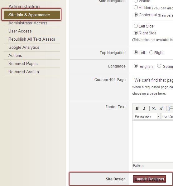
Go into Site Builder and click "Site Info & Appearance" on the left navigation under Administration (you must be a full access administrator or owner to do this). Click the Launch Designer button.
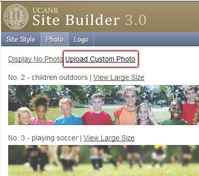
After the design tool window pops up, click "Photo" on the top blue bar. You should see a link that says "Upload Custom Photo." Click the link.
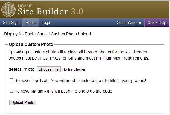
Select your photo (990px minimum width, height will adjust) using the form and save. I'll show you what the other two options do in just a moment.
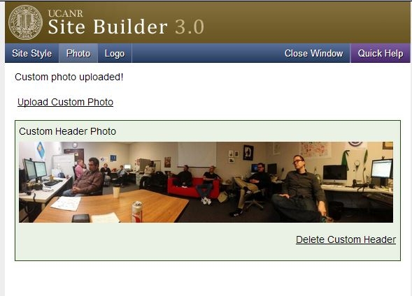
Your photo has now been uploaded. If you don't like it, you can click the delete link to remove it, or upload a new image.
Your header photo has been replaced! One caveat: only one custom header can be uploaded per site, and it will replace ALL header photos on each page. At some point, we will add this feature per page, but for now, it's site-wide.
The other two options from the upload image form will do two things, both of which can really harm your site if used improperly!
The first is "Remove Top Text," and it will do just that. If your header image incorporates your site name, you may elect to remove the top text. However, if the site name isn't in your photo, you really shouldn't select this option.
The second is "Remove Margin," and it will remove the space at the top dedicated to the top links and search box. This is useful if your banner photo has light background or is higher on the left.
Centennial Ribbon
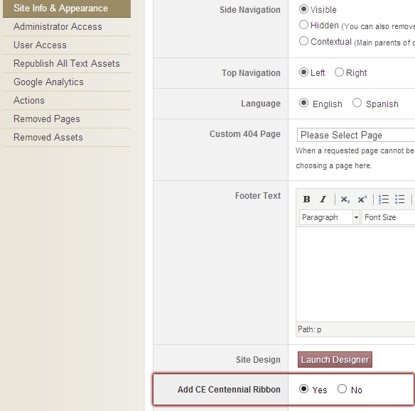
Back in Site Info & Appearance, under the Launch Designer button is a new option to place the Centennial Ribbon over the header photo in the first design option (will also be an option for the mobile design when it becomes available).
If you are using the first design and enable the ribbon, it will look something like this:
If you use the ribbon on the mobile-friendly design, it will look something like this:
These new features offer more flexibility when developing a Site Builder site. If you have any suggestions for other features, please submit them to the ANR IT Help System.
